Profile page
A user reaches the profile page:
- after they complete the personal information task list, if they’re a new user
- after they sign in, if they’re a returning user
The profile page replaces the dashboard and ‘my details’ section in the current service.
The current dashboard uses a large table to show applications and their statuses. Implementing this would be complex and likely to have accessibility issues.
We wanted to try a simpler approach for research.
The profile page shows:
- a button to start a new application
- the user’s personal details, with change links
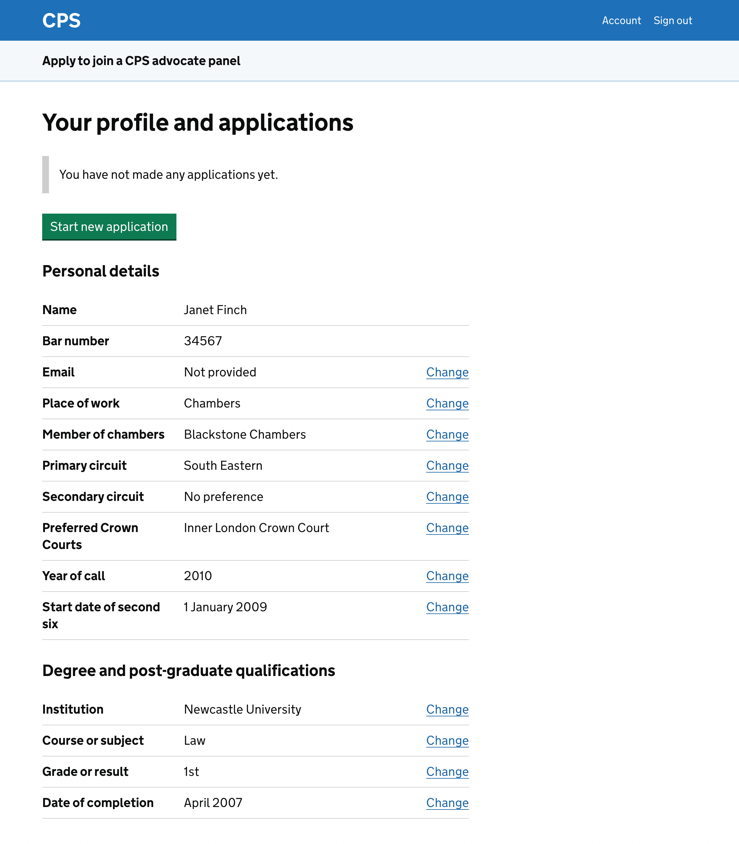
We placed the ‘start new application’ button at the top of the page because we think that it’s the reason that most users will be on the page. We do not have any analytics to confirm this.
We know that some users make more than one application at a time. The button remains visible even if the user has an active application.
If the user has already started any applications then the page also shows:
- the user’s current and previous applications, with a link to each application
- which panels the user is already a member of
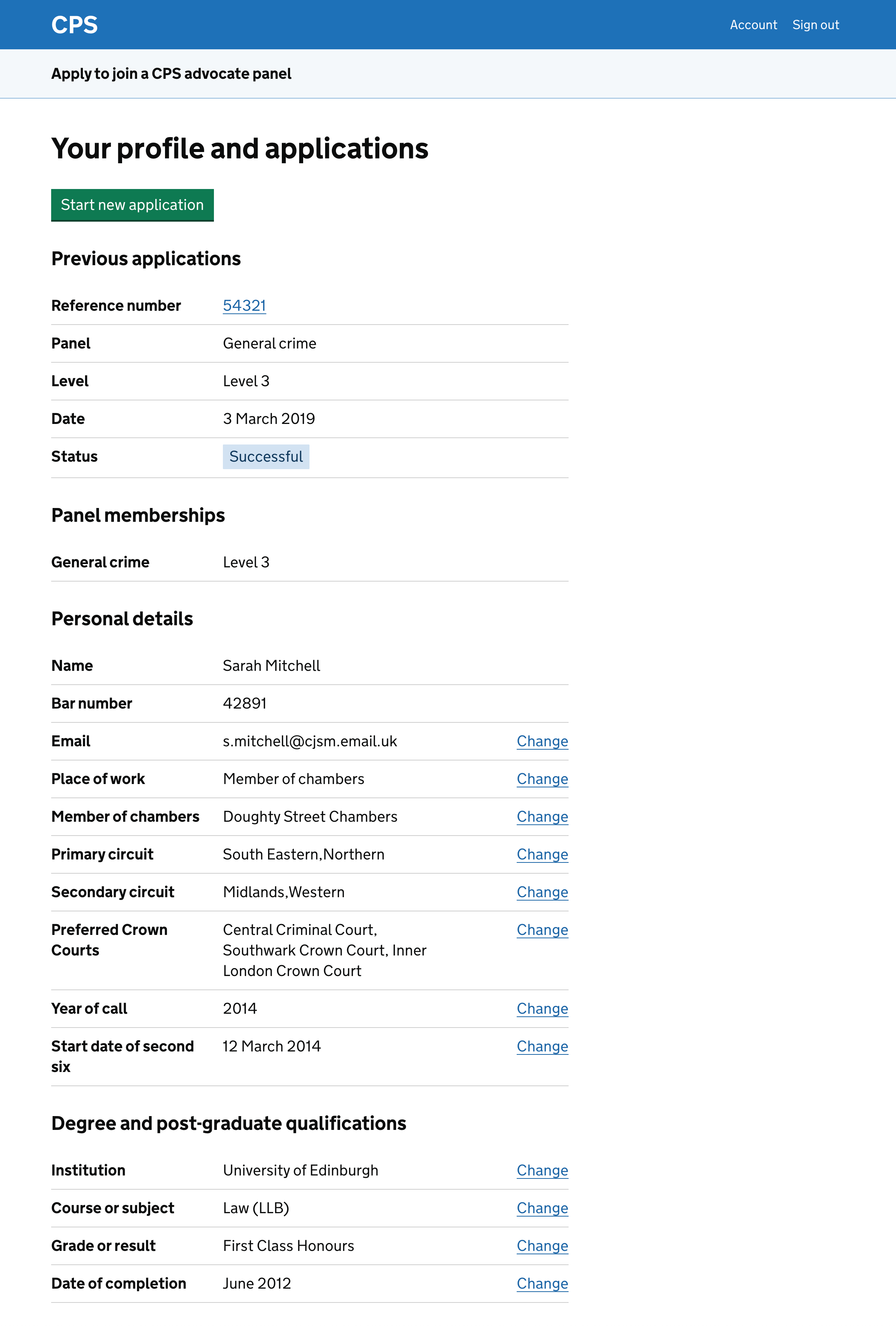
The user can view a previous or ongoing application by clicking on its reference number. This allows the user to carry out tasks such as:
- completing an application which they’ve started but not submitted
- cancelling a reference request and making a new one in its place
- making an appeal after an unsuccessful application
Further considerations
The profile page grew as we discovered that it needed to show more things. For example, panel memberships were added late in the design process.
Extra sections have been added without the page being redesigned as a whole. This was fine for research purposes and participants did not have any problems with it.
However, the page will need more attention in the next phase of the project. For example, we’ll need to:
- make sure that the page works well for users with more applications
- decide what to include in the list of applications
- consider the change links for personal details
- design a journey for users to change email address
- decide whether to indicate that the user has not made any applications yet
- decide whether to show the profile page to new users
- think about what to show to users who click through to an application
- consider whether to mention timelines on this page
Users with more applications
If a user has several applications, the list of them will push the personal details further down the page.
This may not be a significant problem if users rarely change their personal details, or if they realise that they need to scroll down to find them.
We could consider changes such as:
- making it clearer in the page title that the page includes personal details
- separating applications from personal details, using different pages or tabs
- asking users to check some or all of the their personal details before starting an application, for example with a check your answers page
One option would be to combine these changes, for example by:
- showing only the applications and panel membership when the user gets to this page
- showing personal details in a check your answers page when the user starts an application
This would mean that there’s no way to change personal details outside of making an application.
We should investigate various approaches in the next phase of work.
What to include in the list of applications
As a minimum, we need to give enough information for a user to choose which application to click through to.
We may also be able to give them enough information that they do not need to click through. For example in the design we tested, users can see the status of an application without clciking through.
We should explore what information is most useful to show in the list.
Change links for personal details
The profile page shows change links for almost all personal details. In practice, many of these will rarely change.
We should consider whether any change links could be removed. For example, a user’s year of call to the bar will not be changed except to correct a mistake.
In the prototype we left out change links for the name and bar number fields. This should be reconsidered.
Changing email address
It’s likely that the email change link will take users to the authentication system chosen for the service. They will change their name then return to the profile page.
We may need to do some work to make this journey as smooth as possible.
Indicating that the user has not made any applications yet
The prototype has inset text saying that the user has not yet made an application. We should decide whether to keep this or remove it.
Showing the profile page to new users
In the prototype a new user completes their personal details then has the opportunity to check their answers.
After they confirm that the answers are correct, they’re taken to the profile page which shows exactly the same details as the check your answers page.
This is repetitive and may not be necessary.
We could assume that a new user will always want to make an application, skipping the profile page and taking them straight to the panel selection page.
This may be a disjointed journey so we could also consider showing an interim page instead of the profile page.
What we show when a user clicks through to an application
We’ve assumed that if a user clicks through to an application then they’ll see a task list, as they would have seen when they started the application.
If the application has not been submitted then they’ll be able to continue with it.
If it has been submitted then they’ll be able to click through to the tasks but will not be able to change anything.
We should consider the various possible scenarios and test this with users.
Mentioning timelines
We could show users information such as:
- when the window will open for certain application types - this could be tailored by what we know about them
- the deadline for any applications they’ve started but not finished
- when they can expect to get a response to any applications they’ve submitted