Using purple to show AI-generated content
Please be aware that this work was entirely experimental. The AI capabilities described here were never available to users in a live environment, and were not used in CPS casework.
Why we did this work
The Explore the case tool surfaces two distinct types of information side by side.
Data retrieved directly from the CMS, including:
- charges
- dates
- defendant names
Content summarised or interpreted by AI, such as:
- offence narrative summaries
- materials analysis
- evidential assessments
Users will need a clear understanding of what AI is doing at a given point in the tool, and also need to be aware of the risks and potential benefits if they apply the AI-informed content to their casework.
Advocates and reviewing lawyers will use this tool to prepare for and conduct prosecutions. The decisions they make are high-stakes, and sometimes time-pressured.
We needed users to be able to tell, at a glance, which kinds of content they were reading – AI-summarised and interpreted content, versus information derived directly from the CMS without any AI intervention.
This is not because AI content is fundamentally untrustworthy, but rather because it warrants a different kind of engagement.
A charge listed in the case record is factual, having been determined by CPS staff. An offence narrative derived by AI from that information is, by comparison, requires an extra level of professional scrutiny and judgement. Likewise, when AI goes further and provides interpretation of the case facts, users will need to work with even greater caution.
There was no existing GOV.UK Design System pattern for distinguishing AI output from factual data. We needed to design one.
If we got this wrong in either direction - making AI content look indistinguishable from the record, or making it look so alarming that users distrusted it - we would undermine the tool’s value and risk causing ongoing confusion.
How we approached it
We worked through four prototype iterations, tightening the visual language each time.
We considered information hierarchy on the page, the optimum positioning of AI components, and existing colours being used in GDS components.
What we tested and learned
A starting point with no visual signal (version 1)
The first version used a GDS phase banner with an ‘AI’ tag and an inset text disclaimer at the top of the page. The summary cards themselves had no visual distinction — AI-generated content and official case data looked identical.
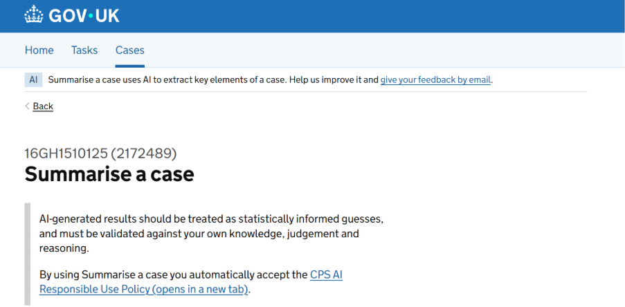
The limitation became obvious in review. The disclaimer appeared once, at page load, while the AI content was spread throughout. A user who scrolled past the top of the page had no ongoing signal about what they were reading, where the human output derived from CMS stopped and where the AI content started.
Cookies-style banner and yellow tag (version 2)
We upgraded the disclaimer to a cookies style-banner above the case summary - a ‘mindful friction’ moment with an ‘I understand’ button to promote user awareness and interaction.
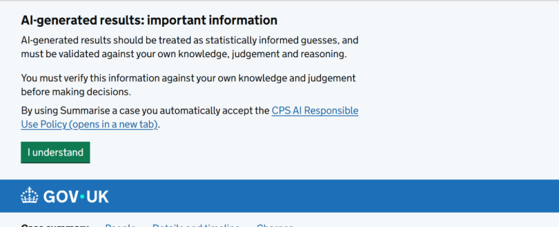
Within the content, we added a yellow ‘AI generated’ tag placed in the title of cards containing AI output. This was more contextual, but the yellow tag created an unintended problem: it was often not seen by users, and those who did read it as a caution signal, suggesting AI content was potentially dangerous. Users might reasonably interpret ‘AI generated’ next to content as a reason to be sceptical, rather than as a neutral, informative label.
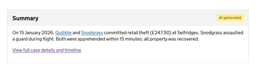
Version 2 also included tags demonstrating the reliability of AI content, adding an extra layer of nuance. For example, a ‘Strong’ tag in the case header was intended to show that the available information strongly supported a given charge. The use of strength tags in the ‘Points to prove’ area likewise demonstrated which points were best supported.
However, users expressed confusion about the source and meaning of the strength tags. They were uncertain about who had applied the tags; when told it was AI, this led to further concern about how AI was scoring each element against the strength rating.
We were also unconvinced that the categorisation of case elements between ‘weak’ and ‘strong’ was clear enough in terms of exact meaning. Did ‘Strong’ mean that the available evidence supported the charge unequivocally, that all materials needed to prosecute were present, or that the AI felt the point in question would be impactful?

Purple as an intentional design language (version 3)
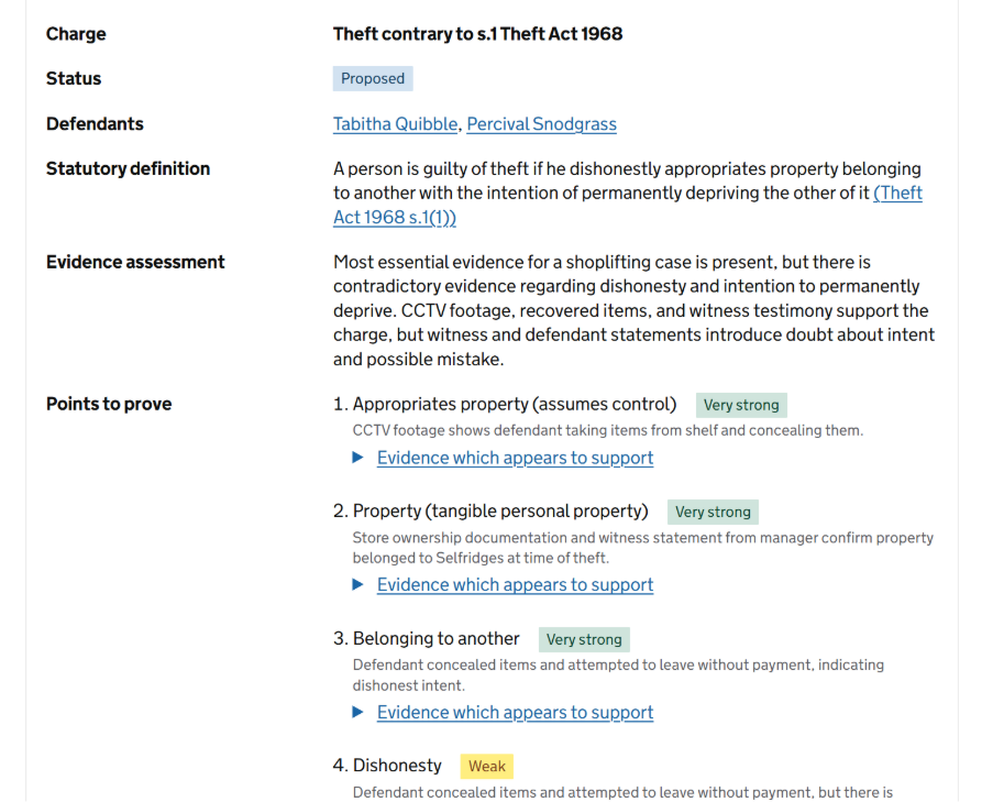
Following on from our learnings in version 2, we refined the tag wordings – adding ‘AI assessment’ in brackets after the strength rating. This was to give users more clarity on the source of the rating.
We also varied our words denoting AI involvement within the tool. We tested phrases like ‘AI assessment’, ‘AI constructed’ and ‘AI assessed’, expanding the repertoire of expressions from ‘AI generated’ in version 2.
In addition, we started separating AI content at a structural level. The charges page gained an ‘AI assessed charges’ tab alongside the standard charges tab, making it possible to move between the official record and the AI interpretation of what charges might apply, without the two bleeding into each other.
The cookies-style banner was dropped from this version. The rationale was that in-card labelling did the job better: the signal was persistent and contextual, rather than a one-time gate that users would naturally click through without reading. Testing showed us that if by chance users had read it, they easily forgot.
We also introduced the first explicit use of purple: a dashed purple outline on the tags, a purple indent, and a purple background tint.
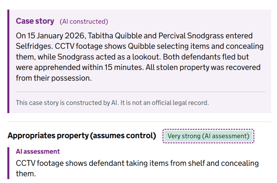
The initial use of purple was exploratory. We used purple as a border accent rather than a fill in some tags, because the fill colour of the tag itself was important for someone to notice at a glance. We also tested the purple background tints, indents and words, taking a variable approach.
These updates marked the point at which we started thinking of purple as the AI colour of choice.
Why purple?
The GOV.UK colour palette gave us some constraints to work with. The following colour in the palette already carry established meanings in the GDS context:
- Green - factually correct, successful or verified messages
- Red - incorrect, error, interruption or warning messages
- Blue - for important information and GDS brand colour. Risks being ignored due to overuse, and carries too much implicit trust
- Grey - used for secondary information, input hover states and orders. Extensively present throughout GOV, so also risks being ignored
- Yellow - used to indicate which element is being focused on
Purple - used to indicate a link the user has visited.
While purple has a pre-existing use case within GDS, it is a specific type of purple which the user encounters in the context of selecting a link. The use of this type of purple is limited in scope and function, and does not have the same weighting as other colours.
Therefore, our chosen purple – in several tints - stood out as the right choice precisely because it carries no pre-existing meaning in the GOV.UK Design System.
Purple creates a new category — one so far unused across CPS tools. It marks the author of the content as a machine, separating it from anything written by a lawyer, police officer, or other human contributor. A high contrast ratio also ensures it remains accessible to all users. It is distinctive enough to be noticed, and neutral enough not to imply urgency or alarm.
In western cultural symbolism, purple is representative of two distinct and contradictory poles. On the one hand, it connotes conservative, establishment power. Roman emperors, royalty and members of the Catholic church all wear purple. The Purple Heart is the longest-running award in the United States military. On the opposite end, purple connotes radicalism, playful freedom and alternative modes of individual self-expression. Consider punky hairstyles, Prince’s ‘Purple Rain’ and even Barney the dinosaur.
At a point in history when AI is viewed ambivalently, with both hopes for innovation and deep misgivings, purple emerged as a natural choice to signify an emerging technology, and to distinguish AI-informed content.
Applying the pattern consistently (version 4)
By version 4, we had clarified the scope of the pattern: purple applies only to content that AI has summarised, constructed, or interpreted. Data retrieved directly from the case record — charge titles, timeline events, defendant names, dates — remains in standard GOV.UK styling. The colour is a signal about the nature of the content, not about the tool itself.
The offence narrative card had settled on a purple top border (border-top: 4px solid #732282) combined with the lavender background, with a yellow ‘AI summary’ tag in the card header. We chose a top border for this card, rather than a left border, because it needed to sit at the same visual weight as the other summary cards on the page without becoming a visually disconnected aside.
The materials section introduced conditional colour for AI analysis outcomes: purple and lavender when AI had flagged a potential issue (missing material). This extended the AI pattern’s usage as an analytical function, not just a labelling one.
The final design patterns
Our expression of AI to users eventually crystallised into the purple AI content panel that appears at key junctures within the Explore the case design.
Crucially, these panels offer the user two distinct categorisations of AI-informed content:
AI summary
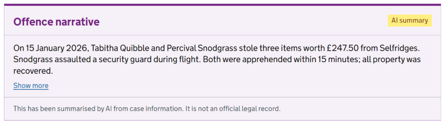
AI summary shows content that has been derived directly from existing case information on CMS, then restructured and summarised by AI. For example, the offence narrative.
AI analysis
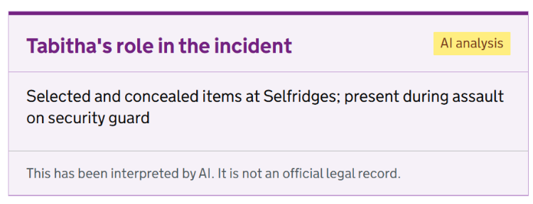
AI analysis shows content that has been interpreted by AI. For example, a person’s role in the incident.
In each instance, the purple panel states clearly what the user can expect from the content inside it, and how AI has been involved.
A footer disclaimer in the panel also heightens awareness and mindfulness about AI intervention. Two tailored messages are offered, depending on the type of AI content:
This has been summarised by AI from case information. It is not an official legal record.
This has been interpreted by AI. It is not an official legal record.
This kept the caveat close to the content it describes, rather than separated from it at the top of the page – another piece of content to aid awareness and mindful friction during a user’s journey.
When not to use purple
When AI has not been involved with the content, purple is not needed.
Do not apply the purple pattern to data directly retrieved from the case management system, without AI intervention. For example, someone’s name or date of birth extracted directly from their case file.
Charges, defendant details, names and dates are all authoritative data, and should be presented in standard GOV.UK component styling.
Recommendations for next steps
Onboarding guidance
Minimal guidance should be considered, to help users understand the difference between AI summary and AI analysis tagging.
This may help those who are new to the tool, but also could be useful as a persistent reference within the tool too.
User research
Explore the case has been tested with purple, but not with other colour options. Whether purple reads as an AI signal to users, or if it carries any unintended associations, needs further interrogation.