Manage case materials – reusing existing patterns
We are designing a way for users to find, organise and work with case materials in large or complex cases.
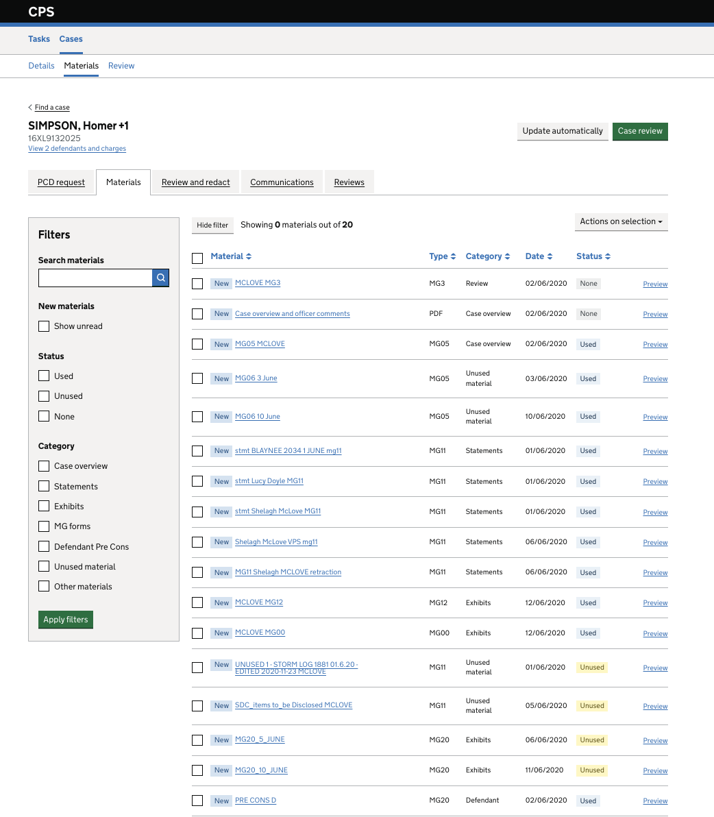
Once materials are transferred to the Shared Drive, users need to:
- view, sort and organise files
- move or copy materials
- rename and preview content
- search and filter effectively
We reused existing patterns from the Housekeeping designs to maintain consistency and reduce the need for users to learn a new way of doing things.
We adapted these patterns based on what we already know about how users work with case materials in the divisions and complex case units.
The designs were informed by usability testing and design iterations focused on how users view, find and organise materials efficiently.
We wanted to pick up these design patterns to ensure consistency and familiarity of experience. We then applied what we had already learned from users to the designs. The key differences we identified were:
- Organising materials into folders would better support the work of divisions and units
- Reducing visible metadata would improve scanability
- Aligning the interface with shared drive patterns would reduce learning effort
Design changes
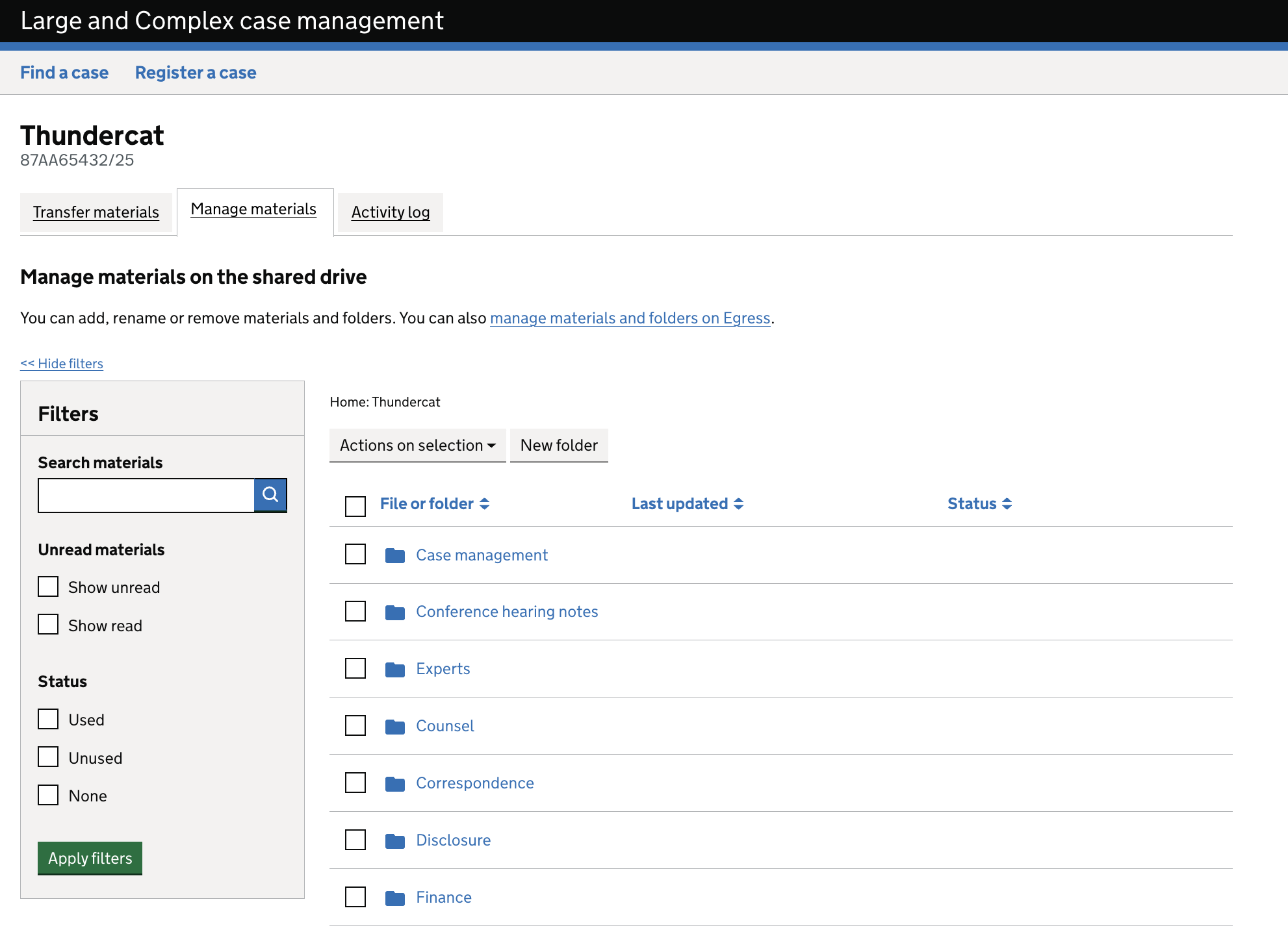
Move from categories to folders
- Replaced categories with folders
Reasoning
Users already think in terms of folders, which makes materials easier to organise and locate.
Improved navigation
- Added breadcrumb navigation
- Enabled users to move easily between folder levels
Reasoning
Users need to understand where they are within a hierarchy and move efficiently across it.
Prioritised key actions
- Introduced a ‘New folder’ button
- Moved ‘Actions on selection’ closer to selected items
Reasoning
Reducing the distance between content and actions lowers interaction cost and improves efficiency.
Simplified layout
- Updated filter panel to create more space for primary actions
- Reduced clutter on the right-hand side of the interface
- Added a contextual header to explain the view
Reasoning
A clearer layout helps users focus on completing tasks rather than interpreting the interface.
Improved filtering
- Updated read/unread filters
- Retained status filters (used, unused, none)
Reasoning
Users need to quickly identify new or unreviewed materials as part of their workflow.
Updated metadata
- Replaced ‘Date’ with ‘Last updated’
Reasoning
Users prioritise recency when reviewing materials, rather than the transfer date.
Reduced system messaging
- Removed ‘Showing 0 materials out of 20’
Reasoning
The message did not scale well for larger volumes of material and became harder to interpret. Removing it reduces ambiguity and visual noise, supporting clearer understanding.
User needs addressed
This design supports users to:
- Find relevant materials quickly
- Organise materials in a way that reflects their workflow
- Understand what has and has not been reviewed
- Take actions efficiently within the interface
Next steps
Continue iterating based on usability testing.