Evaluating a single Manage materials view
Background
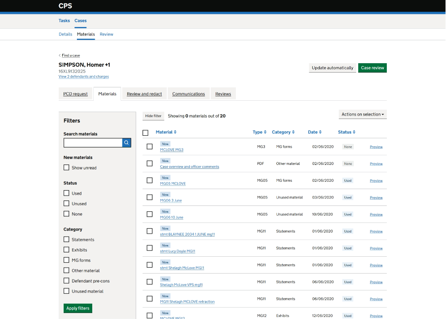
To streamline the user experience, we merged Casework App with Housekeeping UI into a single application. This merged application, known as ‘Manage materials and communications’, has been released to a small number of users as part of a private beta.
The private beta designs for ‘Manage materials and communications’ brought together material management and document review and redaction across two tabs (shown above). Research suggested that users might benefit from a more integrated experience that combines these activities within a single view.
To test this, we created a new concept design that combines material management and document review into one tab, introduces grouped material categories, and provides both list and document views.
User research was conducted with 12 Operational Delivery colleagues and 3 prosecutors to evaluate the proposed design and identify areas for improvement.
Problem
Users need to:
- manage and review large volumes of case material efficiently
- quickly understand what materials have been received
- easily identify new material
- compare multiple documents during reviews
- navigate between overview and document-level tasks without losing context
The existing two-tab approach created additional navigation and separated activities that users viewed as closely related.
A single ‘Manage materials’ tab view
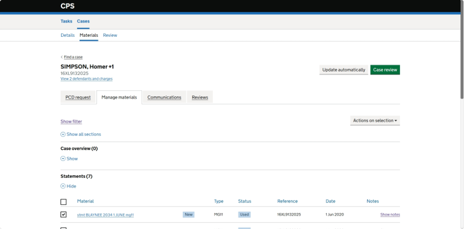
What changed in the single tab view
We replaced the separate ‘Materials’ and ‘Review and redact’ tabs with a single ‘Manage materials’ tab that supports both material management and document review activities.
What we found
Research found strong support for bringing these activities together. Twelve out of 15 participants preferred the new design, commonly describing it as having “everything in one place”. Many users did not initially notice the removal of a tab because they could complete their tasks without needing a separate area.
Users considered document viewing, redaction and material management to be part of the same workflow and saw little value in switching between separate tabs.
Next steps
Proceed with the one-tab approach and continue iterating on the design.
Expected benefits include:
- reduced navigation
- a simpler mental model
- faster completion of material management tasks
Introducing material categories in the list view
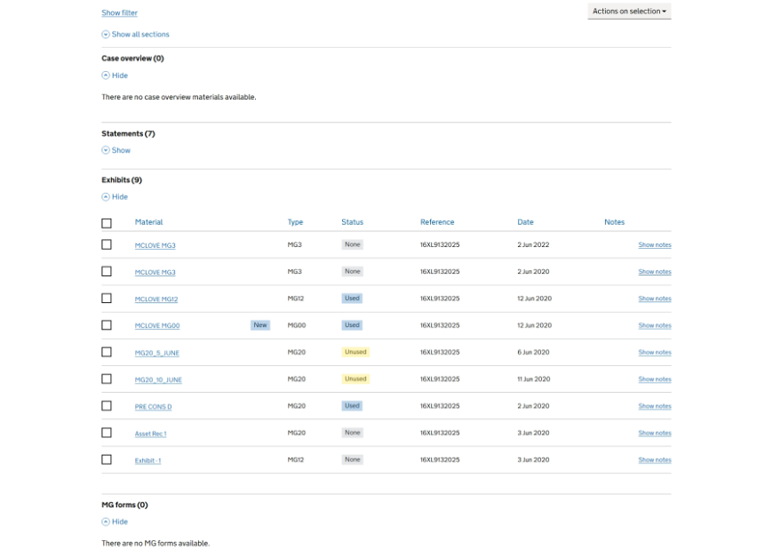
What changed in the list view
The material list was reorganised into expandable category sections rather than presenting all material as a single list.
What we learned about the list view
Participants consistently preferred the grouped view because it made materials easier to find and provided a clearer overview of the case. Users reported that grouping reduced scrolling, improved navigation and was particularly valuable on larger cases.
The grouped structure also reduced reliance on filters because users could navigate directly to the category they needed.
Next steps for the list view
Retain category-based grouping as the primary structure for the materials list.
Expected benefits include:
- better case overview
- faster access to materials
- reduced need for filtering
Reduced emphasis on sorting
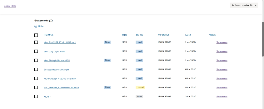
What changed on sorting
We explored sorting controls within category sections.
What we learned about sorting
Research showed little demand for additional sorting functionality. Users reported that category grouping already did most of the work they needed. They also expected materials to be presented in a useful chronological order.
Next steps on sorting
Do not prioritise new sorting functionality in the prototype. Existing sorting functionality can remain where already available.
Clearer positioning of bulk actions
What changed with bulk actions
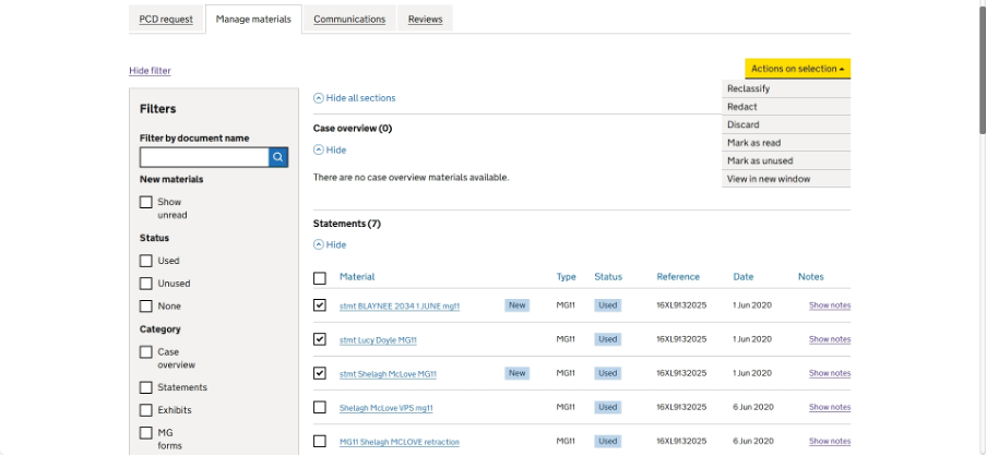
We positioned actions for multiple selected materials in the list view.
What we learned about bulk actions
Participants described bulk actions as a significant efficiency improvement, particularly for reclassification and marking material as read. This was seen as especially valuable for larger cases.
Next steps on bulk actions
Continue developing bulk action functionality.
Expected benefits include:
- reduced repetitive effort
- faster management of large volumes of material
Exploring the value of metadata visibility
What changed with metadata
We included additional metadata in the materials list, including dates and reference numbers.
What we learned about metadata
Research revealed differing user needs. Some users rely on the date a statement was created to understand the sequence of events, while others need the date material was received to identify recent additions to a case. Both dates support different tasks.
Participants also identified exhibit reference numbers as particularly valuable for locating and validating exhibits.
Next steps on metadata
Explore displaying both statement date and received date where possible, with clear labels for each. Consider how and where to show exhibit reference numbers.
Document review screen
What changed with document review
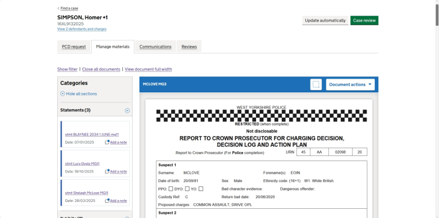
The design included a dedicated document view, similar to the current ‘Review and redact’ tab, while keeping users connected to the wider materials context.
What we learned about document review
Research confirmed that users naturally move between overview and detail views and experienced no significant navigation problems. Users understood how to open documents, move between views and return to the materials list.
Next steps for document review
Maintain the current navigation model while improving the visibility of key actions and links.
Extending filtering
What changed with filtering
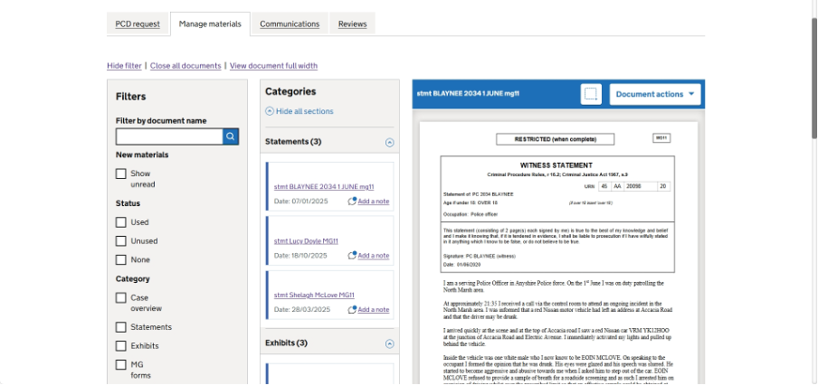
Filters were made available in both list and document views.
What we learned about filtering
Research showed that users value filters when working from the list view, particularly on larger cases. However, most users did not see a need for filters when focused on reviewing a specific document and indicated they would hide them.
Next steps on filtering
Maintain filtering in list view but consider if filters are needed in document view.
Hierarchy of actions in document view
What changed with document actions
Inline links and actions were included within document view.
What we learned about the document actions
Research showed that some embedded links were overlooked because they lacked sufficient visual prominence. In contrast, the document actions dropdown was consistently noticed because it stood out visually.
Next steps on document actions
Increase the prominence and visual hierarchy of embedded document actions and links.
Evidence summary
Research with 15 users found:
- a strong preference for a single Manage materials tab
- a strong preference for grouped material categories
- no significant navigation issues
- support for displaying both material dates and exhibit references where relevant
- a need to improve visibility of some document actions and links
Outcome
This design helped us establish the needs and requirements for a single, task-focused ‘Manage materials’ screen. Research supported the overall direction and demonstrated that users preferred having material management and document review combined in one place.
The next iteration should focus on improving discoverability, strengthening document review capabilities and refining high-value features such as bulk actions, notes, document search and support for reviewing multiple documents simultaneously.