Improving document actions and full-width viewing
Problem
Users reviewing and redacting documents need quick access to common actions while maintaining as much screen space as possible for the document content.
The existing design placed the ‘Document actions’ button within the document header. This meant users had to focus on actions within the document area rather than at the wider page-level. The interface also used ‘Show/Hide categories’ actions, which were focused on the category panel rather than the user’s underlying need to maximise document viewing space.
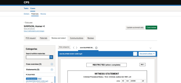
As we continue to align ‘Manage materials and communications’ with the ‘Digital case file’ (DCF) product, we identified an opportunity to make the experience more consistent and easier to use.
What did we change
Moved document actions to the page header
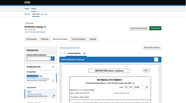
We moved the ‘Document actions’ button from the document header to the main screen.
This places the action alongside other page-level actions and makes it easier to find.
Replaced category actions with full-width viewing
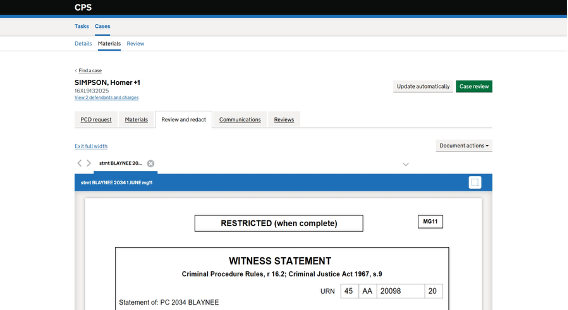
We replaced the Show/Hide categories button with links to:
- View document full width
- Exit full width
Selecting ‘View document full width’ hides the categories panel and expands the document area across the available screen space. Selecting ‘Exit full width’ returns the user to the standard layout.
Why we made these changes
Making actions easier to find
Users expect global actions to be in a consistent place. Moving ‘Document actions’ to the page header brings it in line with other screen-level actions and reduces the effort needed to locate it.
Prioritising document review and redaction
Reviewing and redacting documents is the primary task on this screen. Providing a full-width view gives users more space to focus on document content and reduces the likelihood of horizontal scrolling.
Using language that reflects the user’s goal
The previous actions described what the system was doing to the categories panel. The new links describe what users want to achieve: viewing the document in a larger format.
This makes the action more outcome-focused and easier to understand.
Supporting future alignment with Digital Case File (DCF)
The updated layout aligns more closely with patterns being used for the DCF product. This reduces variation between products and helps create a more consistent user experience over time.
Expected outcomes
We expect these changes to:
- improve the discoverability of document-level actions
- reduce the need for users to scroll to access actions
- provide more space for reviewing and redacting documents
- reduce horizontal scrolling where possible
- align the experience with DCF